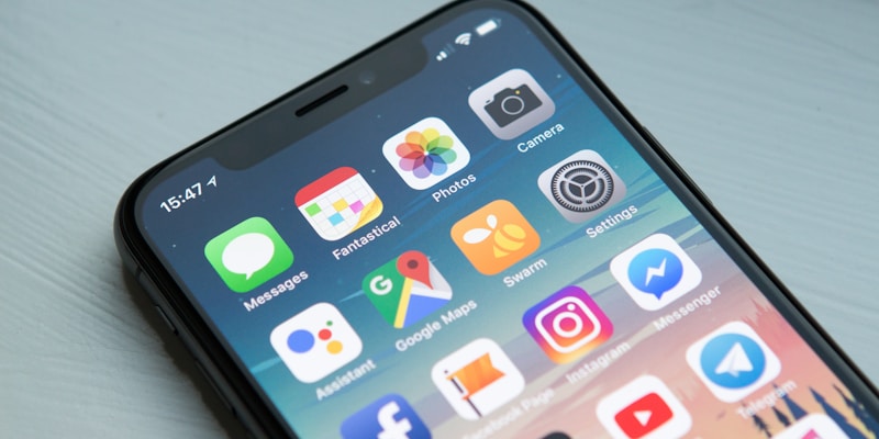
With over 60% of emails opened on mobile devices, mobile optimization isn't optional—it's essential. This guide covers everything you need to know about creating emails that look great and perform well on smartphones and tablets.
Why Mobile Optimization Matters
- User Behavior: 60%+ of emails are opened on mobile devices
- Quick Decisions: Mobile users decide within 3 seconds whether to engage
- Delete Rate: 80% of people delete emails that don't display well on mobile
- Conversion Impact: Mobile-optimized emails have 15% higher click rates
Mobile-First Design Principles
Single Column Layout
- Stack content vertically for easy scrolling
- Avoid complex multi-column layouts
- Use full-width design (600px max)
- Ensure content flows naturally top to bottom
Touch-Friendly Elements
- Button Size: Minimum 44px height and width
- Spacing: 10px minimum between clickable elements
- Link Areas: Make entire button area clickable
- Finger-Friendly: Consider average finger size (44-57px)
Typography for Mobile
Font Sizes
- Subject Lines: 30-40 characters max
- Headlines: 22-28px font size
- Body Text: 16px minimum (14px absolute minimum)
- Captions: 14px for secondary text
Readability
- Line Height: 1.4-1.6 for optimal reading
- Line Length: 50-75 characters per line
- Contrast: High contrast between text and background
- Font Choice: Sans-serif fonts work best on screens
Image Optimization
Image Sizing
- Width: 600px maximum for email body
- Hero Images: 600x300px recommended
- Product Images: Square format works well (300x300px)
- File Size: Keep under 100KB per image
Responsive Images
- Use CSS media queries for different screen sizes
- Set max-width: 100% for automatic scaling
- Consider using srcset for high-DPI displays
- Always include alt text for accessibility
Subject Line Optimization
Mobile-Specific Guidelines
- Length: 30-40 characters (vs 50 for desktop)
- Front-Loading: Put key words at the beginning
- Emoji Usage: Can increase open rates by 45%
- Preheader Text: 90 characters visible on mobile
Testing Subject Lines
- Test on actual mobile devices
- Check truncation across different email clients
- Consider how subject lines appear in notifications
- Test with and without emojis
Call-to-Action Optimization
Button Design
- Size: 44px minimum height, 88px minimum width
- Color: High contrast with background
- Text: Clear, action-oriented language
- Spacing: Plenty of white space around buttons
CTA Placement
- Place primary CTA above the fold
- Repeat CTAs in longer emails
- Use thumb-friendly positioning
- Avoid placing CTAs too close to screen edges
Email Client Considerations
iOS Mail
- Good CSS support
- Automatic phone number detection
- Supports media queries
- Handles responsive design well
Gmail Mobile App
- Limited CSS support
- Strips some media queries
- Auto-fits content to screen
- Test thoroughly on this client
Outlook Mobile
- Uses Word rendering engine
- Limited responsive support
- Focus on single-column layouts
- Test button rendering carefully
Testing Mobile Emails
Device Testing
- iPhone: Test on multiple iOS versions
- Android: Test on Samsung, Google Pixel devices
- Tablets: iPad and Android tablets
- Screen Sizes: Small (5"), medium (6"), large (6.5"+)
Testing Tools
- Litmus: Comprehensive email testing
- Email on Acid: Mobile preview testing
- SendEmailPro Preview: Built-in mobile testing
- Browser Dev Tools: Mobile device simulation
Performance Optimization
Loading Speed
- Optimize image file sizes
- Minimize CSS and HTML
- Use web-safe fonts to avoid loading delays
- Limit the number of images
Data Usage
- Consider users on limited data plans
- Provide text alternatives to images
- Use efficient image formats (WebP when supported)
- Compress images without quality loss
Accessibility on Mobile
Screen Reader Support
- Use semantic HTML structure
- Include descriptive alt text for images
- Ensure proper heading hierarchy
- Use ARIA labels where appropriate
Visual Accessibility
- Maintain high color contrast ratios
- Don't rely solely on color for information
- Use sufficient font sizes
- Ensure touch targets are large enough
Mobile Email Trends
Interactive Elements
- Accordion menus for content organization
- Image carousels for product showcases
- Hamburger menus for navigation
- Progressive enhancement for unsupported clients
Dark Mode Support
- Design for both light and dark themes
- Use CSS media queries for dark mode
- Test logos and images in dark mode
- Ensure text remains readable
Optimize Your Mobile Emails
Create mobile-first email campaigns with SendEmailPro's responsive templates and mobile preview tools.
Start Optimizing